Making STEM Exciting for Young Learners: SPARC Science of Philadelphia & Beyond

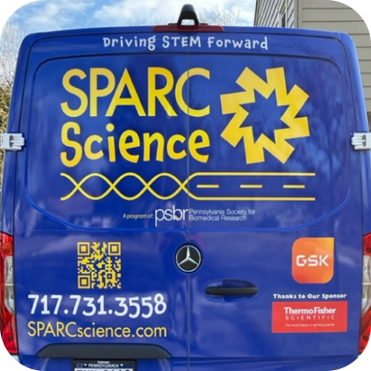
Mobile Science Van Update !

Pennsylvania Society for Biomedical Research
Sponsored by Merck

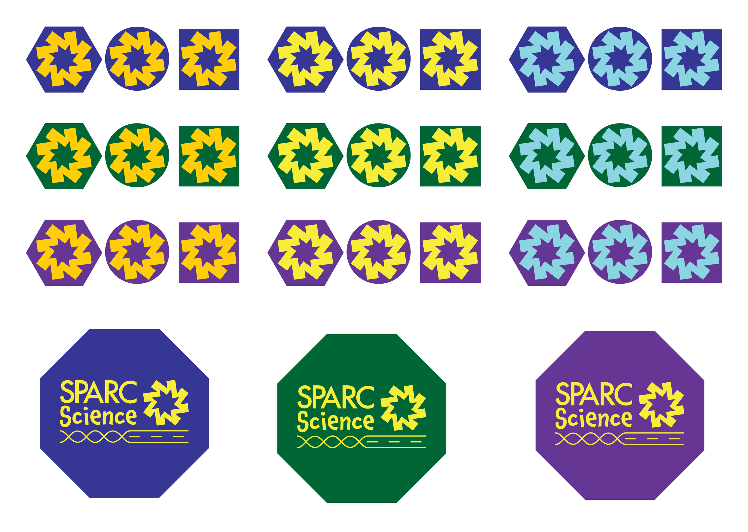
Brand Refresh included: Name Change, Logo Suite, Typography, Color Palette, Brand Guidelines, Custom Marks, Lines, Color Gradient Selections & Best Practices


As a mobile science program bringing exploration and discovery to underserved students, SPARC Science needed a branding overhaul to best serve young learners. Not only was their original logo a little more confusing and harder to read than they wanted, SPARC wasn’t the only organization with that name in their area! Simply adding Science to their branding guidelines was the first step both for ease of recognition and SEO purposes. While I’ve suggested changing the name of each of the organizations I’ve worked with so far, SPARC Science is the first to take me up on it – I definitely feel it was the right choice!


It was also an interesting and delicate journey to work with them on changing their existing logo. It had been designed by a friend, so even though it was missing the mark in terms of where my clients wanted to be, navigating those sensitive waters was a valuable learning experience. Ultimately we were able to retain the spirit of the original logo while updating and clarifying it.
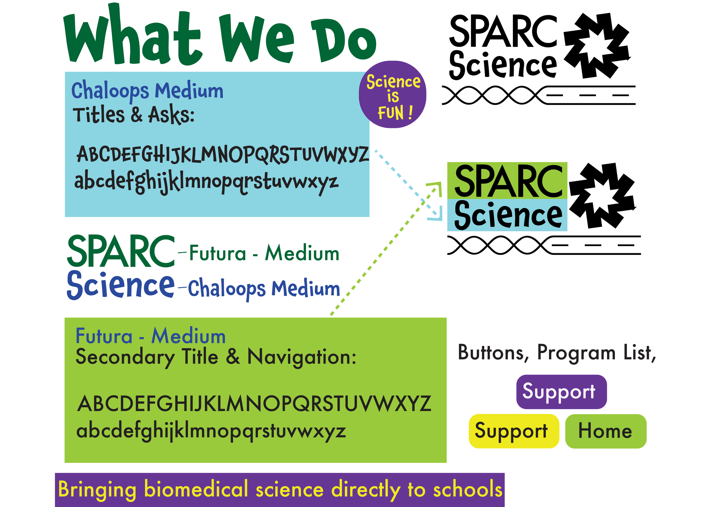
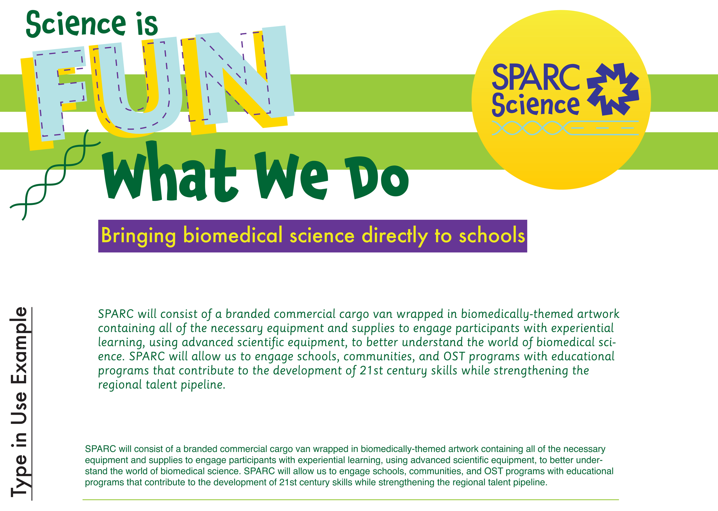
Next, we worked on fonts for different elements of the learning experience. Since multiple audiences use the SPARC Science van – parents, teachers, and students – we decided to use a variety of fonts to speak to each clearly.
For the future scientists, we settled on whimsical and light-hearted Chaloops. Sassoon Primary provides instructions to young learners in an easy-to-read manner. The professional Helvetica is used to signal the need for adult participation and/or guidance, while Futura’s overarching authority acts as SPARC’s voice (such as ‘donate here!’). On the van itself, we worked to ensure that the static nature of the fonts was easy to read even when the van was in motion.


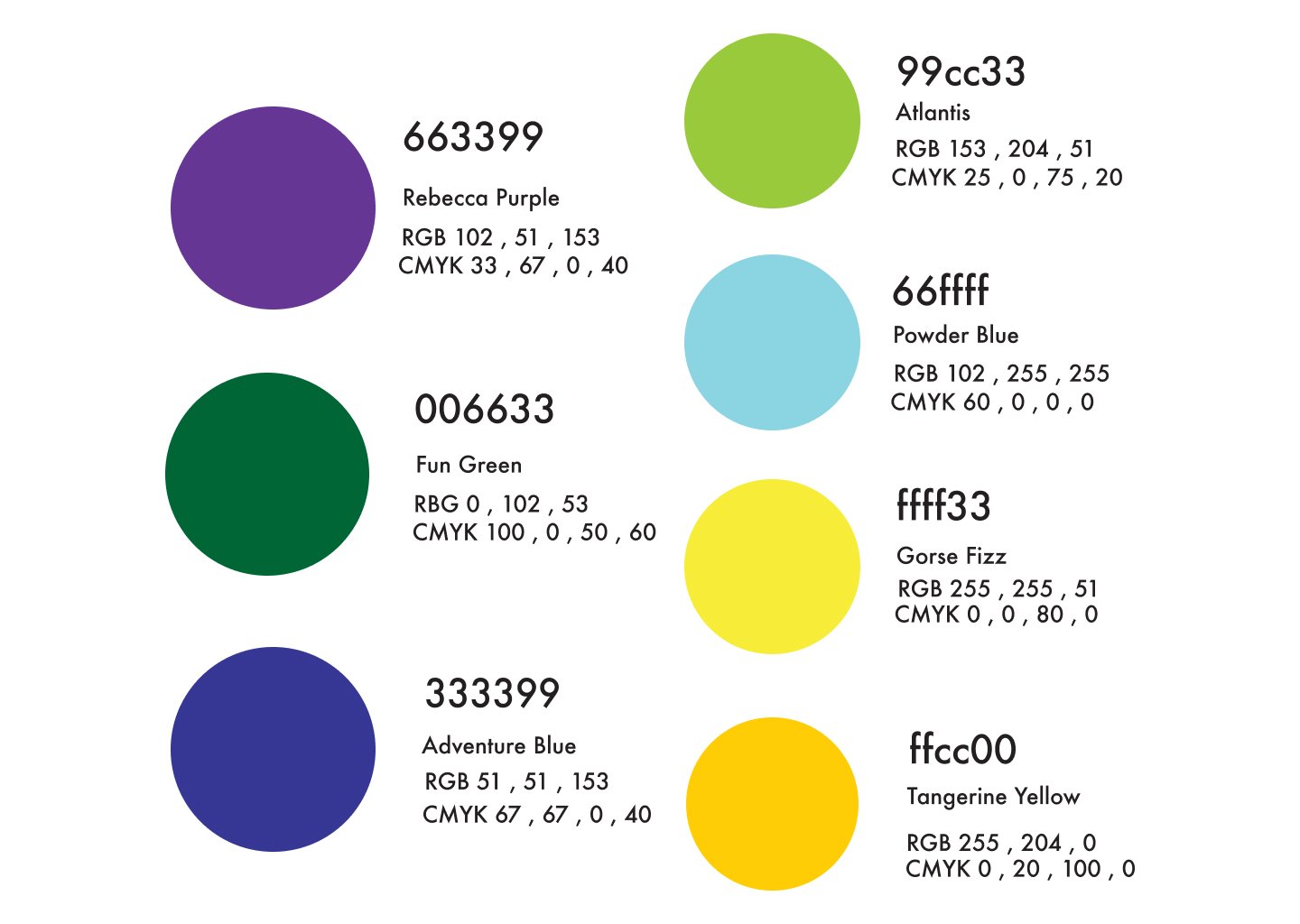
This color palette combines familiar colors (like school bus yellow and racing stripe blue) with joyful, appealing tones to interest boys and girls alike. These colors also engage children of a wide age range and social sophistication, providing an inclusive environment.


“Jay is a very talented artist and graphic designer who worked tirelessly on our project to design a set of branding guidelines. With his assistance, we can now expand our programming with a common theme and brand across our educational outreach. Jay was open to our suggestions and incorporated our feedback into his final designs. We cannot thank him enough for his time and efforts!”


Science Education and Reaching a Diverse Audience with Respect
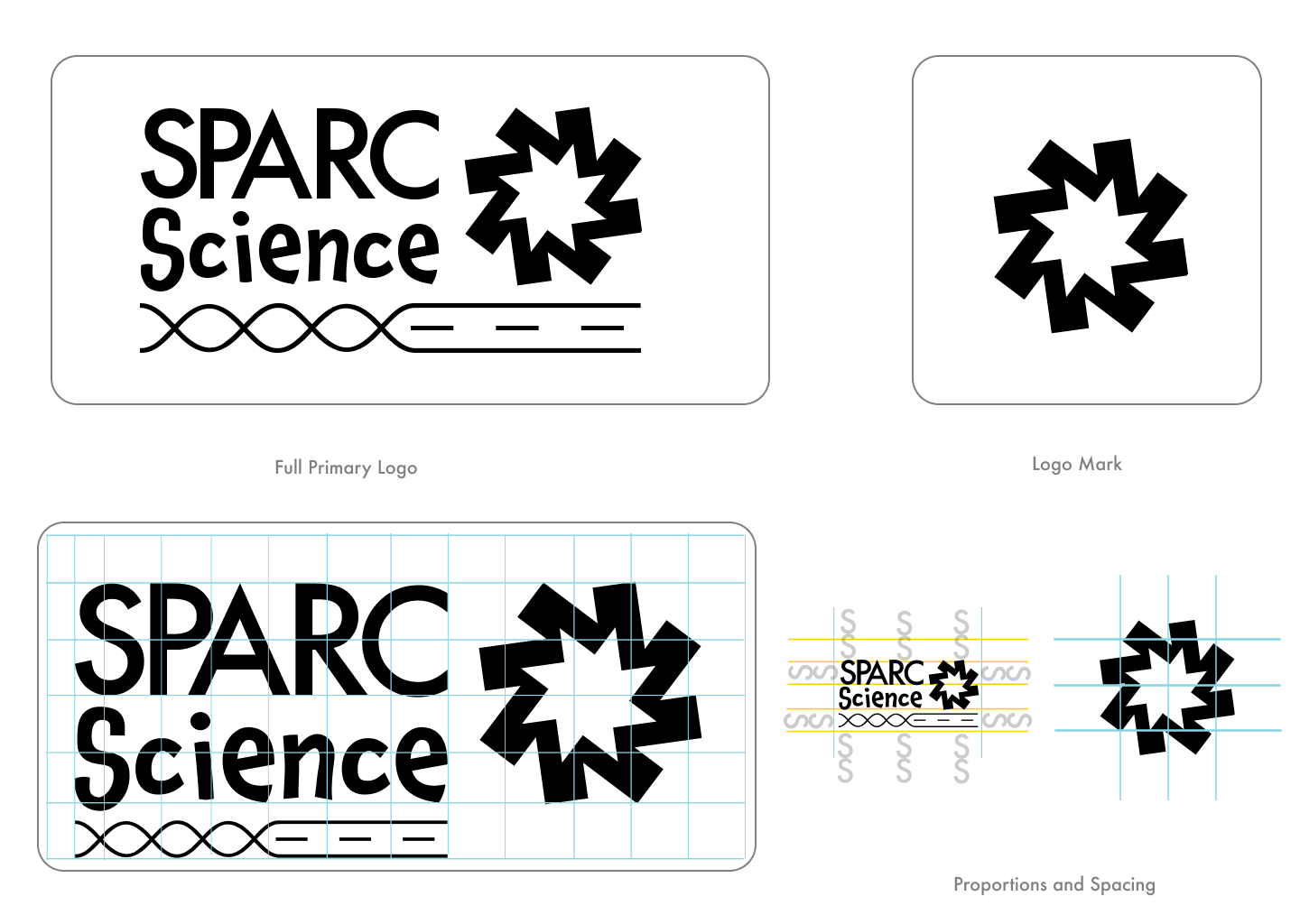
The full primary logo prominently features SPARC Science. Beneath it sits a rendering of a DNA double-helix that transforms into a road, representing the mobile aspect of SPARC Science. The eight-pointed pinwheel to the side will serve as a short-hand visual for SPARC Science and is based on an updated understanding of the building blocks of DNA and RNA. In that same spirit, the logo evokes the electrifying excitement of discovering something new. That spark is what SPARC Science aims to bring out in tomorrow’s explorers.